Cool Infographics has Moved!

You will be automatically redirected to the new site.
Please update any links and bookmark to http://coolinfographics.com


The chart shows the "depth" of various solar system gravity wells.
Each well is scaled such that rising out of a physical well of that depth - in constant Earth surface gravity - would take the same energy as escaping that planet's gravity in reality.Click on the image to go to the xkcd.com site to see the high-resolution version.


The Bureau of Labor Statistics has found that people who finish degree programs in college earn much more over the course of their lifetimes than those who only earn high school diplomas or drop out of college. Sometimes the difference can be over a million dollars before retirement. But even more interesting, it was noted that people with undergraduate and graduate degrees manage to stay employed for longer periods, but also find jobs they qualify for more quickly. They spend less time searching and more time working.

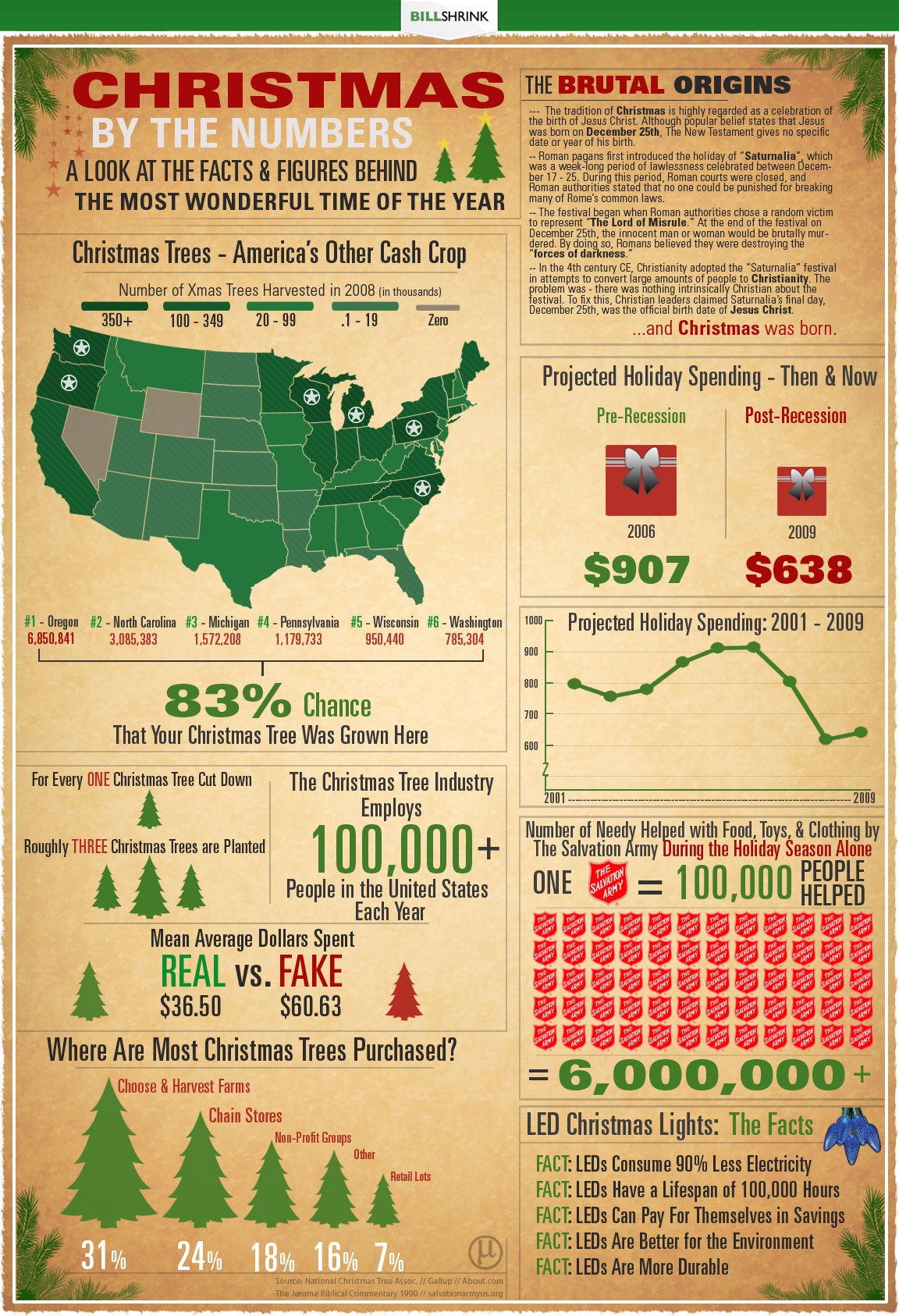
‘Tis the season for Christmas trees, lights and gifts, and in the past that has also meant the season of outrageous spending. While the holidays may not be cheap, hard times sometimes call for desperate measures and drastic budget changes. Here’s a look at the hard facts and numbers of this most wonderful time of the year.Merry Christmas from Cool Infographics!


“Get your ducks in a row” so that you aren't “caught with your pants down” this holiday season! After all, it can be like “herding cats” out there this time of year, and you definitely don't want to get stuck “in the weeds.” So, go ahead and take a minute to “shop this around,” “see if it sticks” and celebrate from a “10,000-foot view.” It's all “blue sky” from here on out, nothing but a “win-win situation!”
Think you know your business clichés? Find where they're hiding in this holiday XPLANATiON™ created by your friends at XPLANE! Just click the image above to download the tabloid-sized 11x17" PDF.Thanks to Parker at Xplane.com


Using Google's enormous bigram dataset, I produced a series of visualizations that explore word associations. Each visualization pits two primary terms against each other. Then, the use frequency of words that follow these two terms are analyzed. For example, "war memorial" occurs 531,205 times, while "peace memorial" occurs only 25,699. A position for each word is generated by looking at the ratio of the two frequencies. If they are equal, the word is placed in the middle of the scale. However, if there is a imbalance in the uses, the word is drawn towards the more frequently related term. This process is repeated for thousands of other word combinations, creating a spectrum of word associations. Font size is based on a inverse power function (uniquely set for each visualization, so you can't compare across pieces). Vertical positioning is random.


"The Simpsons" stands on the comedic shoulders of many that came before -- and has influenced countless works that have arrived since. Here are just a few of the roots of the "Simpsons" comedy tree and the branches of those it gave life to. (The following, illustrated by the doughnut at the top of the story, is by no means complete, and each member has its own, sometimes overlapping influences.)
Thanks to Tony Hendra's "Going Too Far" for inspiration and cartoonist Art Spiegelman for having his fingerprints all over the place.The article also includes descriptions of the actual influence for each of these shows.

Follow me on Twitter

Follow the Twitter List
"Cool Infographics People"

Subscribe on your Amazon Kindle


